- de
- en
Table of Contents
Questionnaire for Smartphones
The proportion of participants filling out a questionnaire on a mobile phone varies significantly depending on the study. However, in most studies, it is essential to assume that a significant portion of respondents will complete the questionnaire on a small display. In practice, the following scenarios arise:
- The questionnaire should work everywhere
Often, participants should just be able to complete the questionnaire - regardless of whether they are using a laptop, tablet or smartphone.
- Questionnaire for mobile devices only
Some study designs, such as diary studies or mobile experience samples, are designed to be completed on the mobile device only.
- Questionnaire for computers only
Other study designs are not suitable for smartphones, e.g. when a task requires a great deal of information to be displayed on the screen at the same time or when response times are to be recorded at the touch of a button. In this case, you want to make sure that the questionnaire is not filled in on the smartphone.
Tip: You can also test the display for mobile devices on your computer. To do this, search for the developer tools (Developer Tools in the Browser) in your browser (Firefox, Chrome). There, you will find a switch to the smartphone simulator.
Questionnaire for all devices
Note: Not every questionnaire is suitable for being filled out on the small display of a smartphone. Long scale batteries (more than 10 items) are just as little fun on the small display as long question texts/instructions or long stimulus texts. Not to mention the fact that you might be happy to fill out a 5-minute questionnaire on the bus, but probably not a questionnaire that takes 30 minutes. Therefore, scientific questionnaires, regardless of the presentation, are often not suitable for the small mobile phone display.
The proportion varies between 0 and 100 percent depending on recruitment – but on average every second person (54%, as of Q1/2024) uses a smartphone when they open a questionnaire on www.soscisurvey.de. This does not include tablets, which are unproblematic: : This does not include tablets, which are unproblematic: They offer sufficiently large screens and all SoSci Survey question types can be answered by touch (touch display) just as with a mouse. With smartphones, on the other hand, the small display can become a problem.
Basically any common smartphone browser can display website so small that it fits completely on the screen. However, you will then be unable to read the text or press the buttons for replies. The term “responsive layout” covers various techniques that ensure that a website can be displayed sensibly on displays of different sizes. Essentially, unimportant elements are hidden on small displays and the remaining elements are shown in a different arrangement (e.g. one below the other instead of next to each other).
The standard layouts of SoSci Survey (with the exception of “SoSci Survey Paper”) are designed to automatically adjust to the available screen width. A maximum width is set in the Questionnaire Layout so that the questionnaire does not stretch too much on large screens. However, there are two major limitations for small displays:
- In the questionnaire there are usually no unimportant elements (questions, answer options) that could be omitted.
- Not every question type can cope with as little space as possible.
Questions that use a lot of text (e.g. long item texts) or offer many options cause problems on the small screens of smartphones. In addition, some types of questions, such as the ranking question , rely on items and answer options being displayed as cards next to each other.
Responsive Design
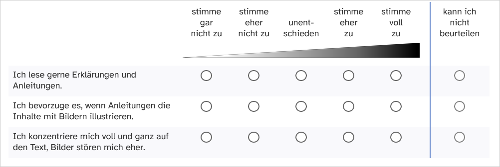
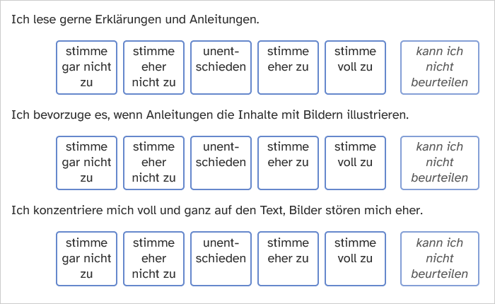
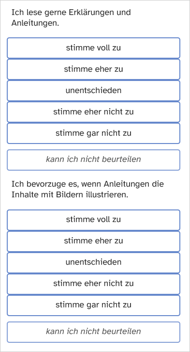
In order for the same question to be presented sensibly on displays of different sizes, the presentation may have to change significantly. This is most obvious with a fully labeled scale in the “dynamic” display variant (standard). Here, SoSci Survey varies between a matrix display with small selection fields on the large PC screen, large selection fields for the tablet (and other small screens) and vertically sorted selection fields on the smartphone in portrait format.


Uniform presentation
Systematic differences in response behavior are not to be expected due to the different representation, because with a reliable scale the representation should not have a significant influence on the response behavior. If the different representation is nevertheless undesirable, the “static” representation can be selected in the question. However, not all selection options may then be displayed on the smartphone - so we explicitly advise against this.
Response Option Order
The selection options in the matrix display are arranged by default from left (minimum) to right (maximum), corresponding to the typical reading direction in Western Europe. The options in the vertical display are arranged from bottom (minimum) to top (maximum), corresponding to the typical direction of fill level indicators.
If you want to reverse the vertical direction, you can add the following PHP code to the page with the question, replacing AB01with the identifier of your scale.
pageCSS('
    @media (max-width: 320px) {
        #AB01_tab div.s2input div.s2options {
            flex-direction: column;
        }
    }
');
Optimizations
To ensure that the questionnaire can be completed effectively on smartphones, we recommend the following optimizations:
- Use short texts.
- The greeting should not contain more than 4 sentences plus a closing phrase.
- Explain how to complete questions (e.g. a Likert scale) only once, when the question appears for the first time in the questionnaire.
- Use the accordeon function and the function for displaying shortened texts (Partially hide a text), so that longer texts do not interfere too much with the overview.
- Avoid Combined Questions – especially if you want to compress more questions into less space. If the questionnaire becomes too long without combined questions, ask again about the suitability of the questionnaire for smartphones.
- For scaled questions, set the arrangement to “dynamic” or “automatic”.(default setting).
- For multiple choice questions, use “dynamic” (standard) or, even better, “cards” as the display. Cards take up more space, but are much easier to hit with your finger on a small display.
- The “selection sequence” question type is particularly easy to use on touch devices, as the answer options are very easy to choose. There is also no need to click on “Next” again.
- If you use audio or video files, embed them using HTML 5 (Media Files in Questionnaires (Audio, Video, Documents)) and make sure that all video formats are converted so that they can also be played on mobile devices (pixel size, data rate, etc.).
- Do not insert manual line breaks into items and texts, but use dollar signs ($$) to determine where the text should not break (wiki-notation)
Filters for Smartphone Users
Using the question type Device and transmitted variables , you can find out, among other things, whether a participant is completing the questionnaire using a smartphone:
* Create a question of type Device and Transmitted Variables. * on the Device tab, check the Format box. * Drag the question to the page where you want to filter – or directly to the first page of the questionnaire.
This question stores whether the participant's browser identifies their device as a computer, tablet or smartphone. For example, if the question has the identifier “GG01”, the following PHP-Code Smartphone-Nutzer: shows smartphone users the question “FM01” and all other users the question “FS01”.
if (value('GG01_FmF') == 5) {
  question('FM01');
} else {
  question('FS01');
}
The following PHP code only displays question “FS02” if the participant is not using a smartphone. Detailed explanations of filters can be found under Filters and Conditional Questions.
if (value('GG01_FmF') != 5) {
  question('FS02');
}
Note: The Device and Submitted Variables question type can also capture the user's screen size. This information may be more useful for some filters than the device format. However, the question must be placed on the page before the filter at the latest (not on the same page as the filter)
Separate Questionnaire
It is possible to present a completely different questionnaire to smartphone users than to other respondents. This can be useful if, for example, different content is to be shown and/or if the questionnaire for smartphone users is to use a different layout.
Note: If you want to ask respondents the same questions in the mobile version as in the PC version, this solution is not recommended
- Under Compile Questionnaire, in the Additional Questionnaires tab, create a second questionnaire or a copy of the questionnaire.
- In the new questionnaire, in the Settings tab, you can optionally set the identifier “mobile”. It is up to you which identifier you specify, but you should clearly identify the mobile version. Save the changes.
- Go to the original questionnaire and under Settings , select the questionnaire you just created under Variant for smartphones . Save the change.
Smartphone users are now automatically redirected to the new questionnaire when they access the main questionnaire.
Important: Changes to a question are adopted in all questionnaires that use the question. If you want to modify a question for display on the smartphone/in the second questionnaire, create a copy of this question ( ) and replace the old question for the new question under Compile Questionnaire in the second questionnaire.
Note: If a filter is provided for the original question, an additional filter must be defined for the mobile copy of the question.
Questionnaires for Mobile Devices Only
If the questionnaire is to be completed exclusively on smartphones, the same [:en:create:optimizations]] as above apply.
For scales, there is a special display for narrow screens (can be selected in the first tab). In addition, with the question type “Scale (with intermediate values)” you can have the scale points displayed as a dropdown - this can be clearer, especially with long answer options.
Depending on the study design, the following chapters may also be helpful:
It may be necessary to reject participants who attempt to access the questionnaire using a desktop or laptop computer. This is done in a similar way to the procedure described above (Filter for smartphone users).
- A functional module of the type “Device and transmitted variables” is required, which determines the format of the device and is placed before the filter in the questionnaire (see [ #filter_for_smartphone users|above]]).
- In addition, a text is created (Text Elements), which has the identifier “GG02” for example and politely advises the participant to complete the questionnaire via mobile device.
For the following code example, it is assumed that the module “Device and transmitted variables” has the identifier “GG01” and the text has the identifier “GG02”. The following PHP code is placed as the first element on the first page of the questionnaire. It already embed “GG01” using 'question()'', so that the module “GG01” no longer needs to be placed separately in the questionnaire.
question('GG01'); // Integrate functional block GG01 to determine the device format
if ((value('GG01_FmF') == 1) or (value('GG01_FmF') == 2)) {
  text('GG02');   // Show text
  buttonHide();   // Hide buttons so that the questionnaire can no longer be completed
}
Note: This PHP code allows filling in using a tablet. To prohibit this, add a check or (value('GG01_FmF') == 2)in the IF filter
Note: The PHP code is intended to prevent the questionnaire from being accidentally completed on the wrong device. Through targeted manipulation, participants may also be able to complete the questionnaire on a device that should not actually be allowed: Some browsers (eg Chrome) can emulate a mobile device, other browsers can transmit a fake browser ID.
Questionnaire for Computers Only
Some content is not suitable for smartphones or even tablet computers. This could be, for example…
- Complex combined questions that ask for detailed information in a compact format.
- Ranking questions that require a lot of space, or questions that measure an implicit attitude based on reaction times, e.g., an IAT (both are also possible on smartphones in principle but may not be desirable for methodological reasons).
- Tests that require a keyboard and/or mouse as input devices.
- Videos to be viewed in a quiet environment (not on a public transport bus) on a computer with speakers.
- Images of websites as they appear on a normal computer, the content of which would not be visible on a small smartphone display
Using filters, you can kindly inform participants who are using a mobile device that it is not suitable for completing the survey. This procedure is equivalent to rejecting participants in smartphone studies (see above).
- Create a question/module “Device and Transmitted Variables” (e.g., “GG01”).
- Create a friendly text (e.g., “GG02”).
- Use filters to display the text at the beginning of the questionnaire to participants using a mobile device.
question('GG01'); // Integrate functional block GG01 to determine the device format
if ((value('GG01_FmF') == 4) or (value('GG01_FmF') == 5)) {
  text('GG02');   // Show text
  buttonHide();   // Hide buttons so that the questionnaire can no longer be completed
}
Use the Variables overview to determine the possible values of the device format for the filter. Code 4 describes a mobile device whose format cannot be determined exactly, code 5 describes a smartphone.

