- de
- en
Table of Contents
Placing Elements Side by Side
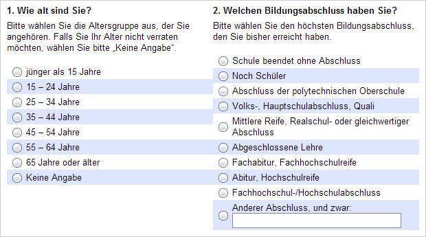
This chapter describes how to place different elements side by side in a questionnaire, such as an image next to a question or two questions next to each other.
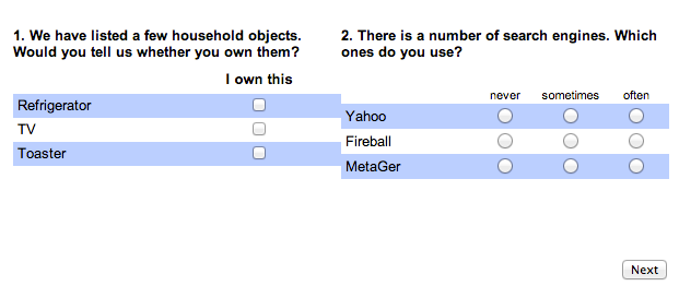
Important: If you want to place two questions with the same items side by side (e.g., for a Fishbein scale), please first read Combined Questions.
Example 1

Example 2

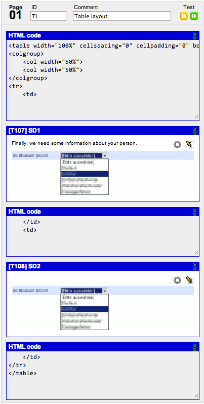
For a step-by-step description of the above example, please read Place Dropdowns Side by Side.
Option A: Flexbox
A Flexbox layout consists of a Flexbox container <div style="display: flex"> and elements within it that are arranged side by side.
The difference from tables (below) is that you can allow Flexbox elements to wrap to multiple lines if there isn’t enough space. This allows elements to be placed side by side on a computer screen and stacked on top of each other on a smartphone.
For more information: CSS Tricks: CSS Flexbox Layout Guide
If you want to place two questions next to each other, you need to add “HTML code” (not to be confused with “PHP code”) on the questionnaire page (Assemble Questionnaire) that essentially creates a frame around the questions. It could look like this. The part between <!-- and --> is a comment and serves only for orientation; these lines are irrelevant for functionality.
<!-- Flexbox container --> <div style="display: flex; flex-wrap: wrap; gap: 0 50px;"> <!-- Start of left element --> <div style="flex: 1 1 400px; min-width: 320px;">

<!-- End of left element --> </div> <!-- Start of right element --> <div style="flex: 1 1 400px; min-width: 320px;">

<!-- End of right element --> </div> <!-- End of Flexbox --> </div>
The width ratio of the two columns is determined by the flex: 1 1 400px setting applied to both elements. If the second element had a larger value, such as flex: 1 1 600px, the right column would be wider. The two ones (1 1) indicate that the elements can grow or shrink based on the base width (400 pixels in this case).
The gap: 0 50px setting in the container indicates that a horizontal space of 50 pixels should be left between the elements. If the elements are displayed one below the other (see below), no gap will be added.
The min-width: 320px setting specifies that each element must not be displayed narrower than 320 pixels. If there is not enough space for both elements side by side plus the gap (320 + 50 + 320 = 690 pixels), for example, on a smartphone or when the browser window is not maximized, the elements will be displayed one below the other (flex-wrap: wrap allows this wrapping). In this case, they will occupy the full available width again.
In place of questions, other elements can also be inserted between the HTML code, such as images or the HTML code for media files.
Option B: Tables
Hint: Tables are easier to control but less flexible. If you expect users to complete the questionnaire on a smartphone, you should avoid using tables.
The basis for a multi-column layout is HTML tables. A simple HTML table looks like this. Below, you’ll see the HTML code for a table with 3 equally wide columns and 2 rows.
| Column 1 | Column 2 | Column 3 | |
| Row 1 | Cell 1/1 | Cell 1/2 | Cell 1/3 |
| Row 2 | Cell 2/1 | Cell 2/2 | Cell 2/3 |
<table>      <!-- This is where the table begins -->
<colgroup>   <!-- This is to define the widths of the columns -->
    <col width="33%">   <!-- Column 1 has a width of 33%, col = column -->
    <col width="33%">
    <col width="34%">
</colgroup>
<tr>         <!-- This is the beginning of row 1, tr = table row -->
    <td>cell 1/1</td>  <!-- This is cell 1/1, td = table data -->
    <td>cell 1/2</td>  <!-- All rows now have 3 cells -->
    <td>cell 1/3</td>
</tr>
<tr>
    <td>cell 2/1</td>
    <td>cell 2/2</td>
    <td>cell 2/3</td>
</tr>
</table>
Hint: The width specification <colgroup> could be omitted, but it’s usually helpful to define the width of each column. Instead of percentages, you can also specify the width in pixels
Hint: HTML also offers layout options without tables, namely CSS positioning. However, advanced HTML knowledge is needed to use them effectively.
Tables in the Questionnaire
This is the theory how to use tables to place two questions side by side:
| Column 1 | Column 2 | |
| Row 1 | Question 1 | Question 2 |
Now, how do we get the questions into the table? This is done easily by writing the table “around” the questions. To do so, you interrupt the table code at the point where the question should be. Once again, below the HTML-code for a table with one row and two columns.
Hint: The table-tag in the following example carries some more attributes. Those are necessary to a) prevent the browser from drawing a line around the table cells (border=“0”) and b) use the whole page for the table (width=“100%”).
<table width="100%" cellspacing="0" cellpadding="0" border="0">
<colgroup>
    <col width="50%">
    <col width="50%">
</colgroup>
<tr>
    <td>Question 1 goes here</td>
    <td>Question 2 goes here</td>
</tr>
</table>
By interrupting the HTML code in the table cells (td), you get three parts:
Part 1
<table width="100%" cellspacing="0" cellpadding="0" border="0">
<colgroup>
    <col width="50%">
    <col width="50%">
</colgroup>
<tr>
    <td> //Question 1 goes here
Part 2
    </td>
    <td>//Question 2 goes here
Part 3
    </td>
</tr>
</table>
Between those parts you can position any questions or other things like images or texts on the compose questionnaire page. (To do so, drag and drop the “HTML code”-brick from the right onto your questionnaire page, put the table parts into an “HTML code”-field for each and add your questions in between)

This is how the example would look like:

Optimizations
Spacing
If you need spacing between the individual questions, add an empty cell in between the questions (in part two).
<table width="100%" cellspacing="0" cellpadding="0" border="0">
<colgroup>
    <col width="45%">
    <col width="10%"> <!-- A third column was added, note its smaller width as it will not contain any content -->
    <col width="45%">
</colgroup>
<tr>
    <td>Question 1</td>
    <td></td>         <!-- This is an empty cell used as a spacer -->
    <td>Question 2</td>
</tr>
</table>

Widths
Browsers may not be able to comply with the specified column widths. This is the case when the cell content is wider than the specified column width. In this case you may solve the problem by the following steps:
- Does the text contain a word that is too long? You can break the word by using
<br>.
Lorem ipsum dolor sit amet, consetetur-<br>sadipscingelitrsed
diam nonumy eirmod temporinvi-<br>dutlabore et dolore magna
aliquyam erat
- Was an image not scaled correctly? Before uploading, images need to be scaled to the correct size. Be aware, browsers recognize the size in pixels only. For more information on this, see Pictures in the questionnaire
Hint: When uploading a different picture with the same file name as an old version, browsers may use the old version from their cache. Try to reload the page.
- If the column widths are still not complied with, you can enforce the browser to do so by using CSS. Add the attribute
styleto the<table>-tag:
<table cellspacing="0" cellpadding="0" border="0" style="table-layout:fixed; width: 100%">
<colgroup>   <!-- The following widths are exactly observed -->
    <col width="33%">
    <col width="33%">
    <col width="34%">
</colgroup>
<!-- etc ... -->
