- de
- en
This is an old revision of the document!
Custom Input Buttons
There are already a number of different display options in the General Settings tab in Questionnaire Layout that can be selected as the input button in Input button style. Selecting the option “custom input buttons” allows you to use your own image.
- To do this, create an image (image set) according to the specifications below.
- Upload the image into the survey project in Images and Media Files (do not use protected filing)
- Choose this image for the Image set in the layout in Input button style → “Custom input buttons”.
After the layout is saved, the new input buttons can be seen in the layout preview (below).
Note: Many participants are used to the default input buttons on their operating systems. Different input buttons can annoy some people. Therefore, Windows makes a clear distinction between radio buttons (round) and checkboxes (square). Other operating systems do not make a visual distinction between the two.
Note: Sometimes custom input buttons appear a little pixelated/blurry on high-resolution displays (e.g. on cell phone devices).
Image Set Guidelines
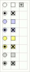
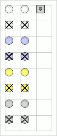
- All images required for custom input buttons are arranged in one_ image with a total size of 96 x 256 pixels in a 32-pixel grid.
- The necessary items are arranged as in the grid displayed below.
- The image is put to the top left in every cell. The number of grid cells displayed is determined in the side length option in “Questionnaire Layout”.
| Radio button | Checkbox | Other |
|---|---|---|
| not selected default | not selected default | category in Extended Selection |
| selected default | selected default | not used |
| not selected focused | not selected focused | not selected |
| selected focused | selected focused | not used |
| not selected mouse over | not selected mouse over | not used |
| selected mouse over | selected mouse over | not used |
| not selected grayed out | not selected grayed out | not used |
| selected grayed out | selected grayed out | not used |
A completed image set looks as follows (only with a transparent background and without guides and frames)
| Image Set with Different Displays for Radio Buttons and Checkboes | Image Set with a Standardized Display of all Input Buttons |
|---|---|
 |  |
