- de
- en
This is an old revision of the document!
Font Hinting
Occasionally, graphics containing contain small, or very small, bits of text are needed in online questionnaires. The text quickly becomes blurry and illegible – usually due to improper scaling or carelessness when exporting the vector graphic.
In general, the best results are obtained by inserting the text directly as text in the website. Image elements and text can be positioned wherever you want using CSS positioning.
The second-best result is obtained by exporting the text (as a vector object) directly in the correct resolution. Image editing software (e.g. GIMP) can be used to do this. Enable hinting by checking the Hinting checkbox in the tool options. Doing this in graphic design software such as Illustrator can be a little more complicated.
Hinting in Illustrator CS 4
Illustrator offers a feature Save for Web & Devices. The result is not bad, but far from perfect.
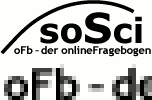
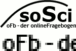
| Save for Web | After Optimization |
|---|---|
 |  |
A few additional steps are needed to transfer small fonts neatly into a raster graphic:
- In Edit → Preferences → Units …, select “Pixel” as the unit for General and Text.
- Scale image or image element to the required size (in pixels).
- Turn on View → Pixel Preview
- Deactivate View → Snap To Pixel
- Deactivate View → Snap To Point
The first impression of how the image will look later on as a raster graphic can be seen here. For further optimization, zoom in closely on the text (e.g. zoom level 400%).
Keep an eye on the sharpness of the horizontal lines here – for example, the horizontal dashes in the upper and lower case versions of E. Illustrator should take care of this as much as possible – but sometimes this is not enough. If need be, make the font size a little bigger or smaller to ensure the parallel horizontal lines look sharp on the raster grid.
- Go to the menu item Edit → Preferences → General → Keyboard Increment and set a lower value, e.g. “0.1 pixels”
Use the arrow key to shift the text to the left and right – this means you can see when the letters fit better into the pixel grid, or when it does not look as good. If one vertical dash is always razor sharp, wheres the other is always blurry, play around a little bit. with the character spacing.
- If the overall image is right, select all the objects and select Object → Rasterize. For Resolution, select “Screen”, for Background, select “white”.
After you have confirmed this with OK, you will not see a difference as you are already in the Pixel Preview. If you switch to the normal view as a test, you will see that the text has been pixelated.
- Last but not least, save the image with File → Export as a graphic, for example in PNG format.
